Graphic Design
Gotham Typespecimen Design
Gotham is a commissioned school project in which I designed a complete type specimen to showcase the context, history, and personality of the iconic Gotham typeface. Through a clean, structured layout, balanced compositions, and thoughtful visual accents, the design brings together research and storytelling to highlight the font’s origins, characteristics, and cultural impact.
Year :
2025
Commissioned by:
HOGESCHOOL VAN AMSTERDAM
Project Duration :
5 Weeks

GOTHAM: AN IN-DEPTH EXPLORATION OF FORM AND FUNCTION
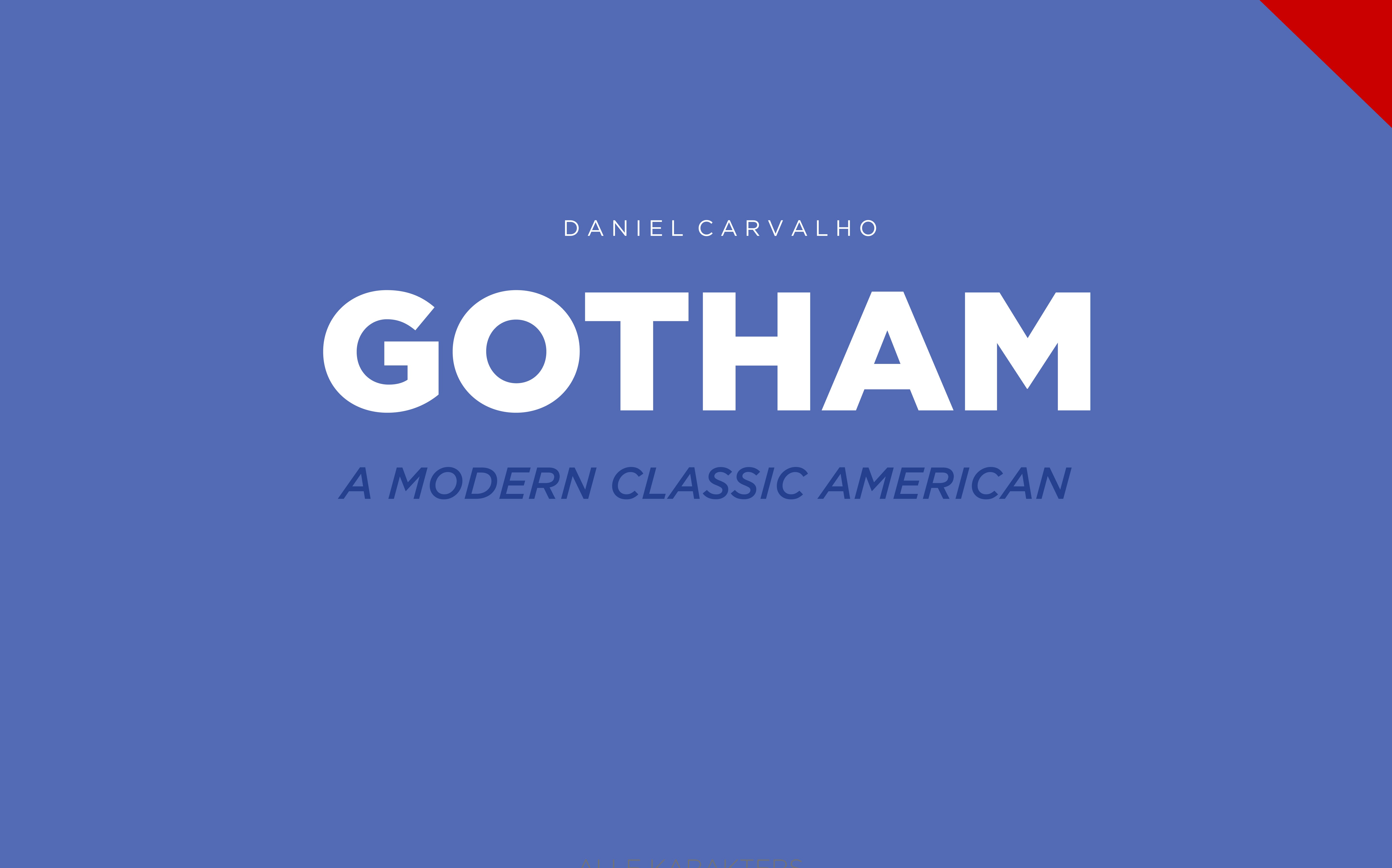
For this commissioned school project at the Amsterdam University of Applied Sciences, I designed a type specimen that explores the story, character, and impact of the iconic Gotham typeface. The goal was not just to show its letterforms, but to create a design that reflects its personality and roots.
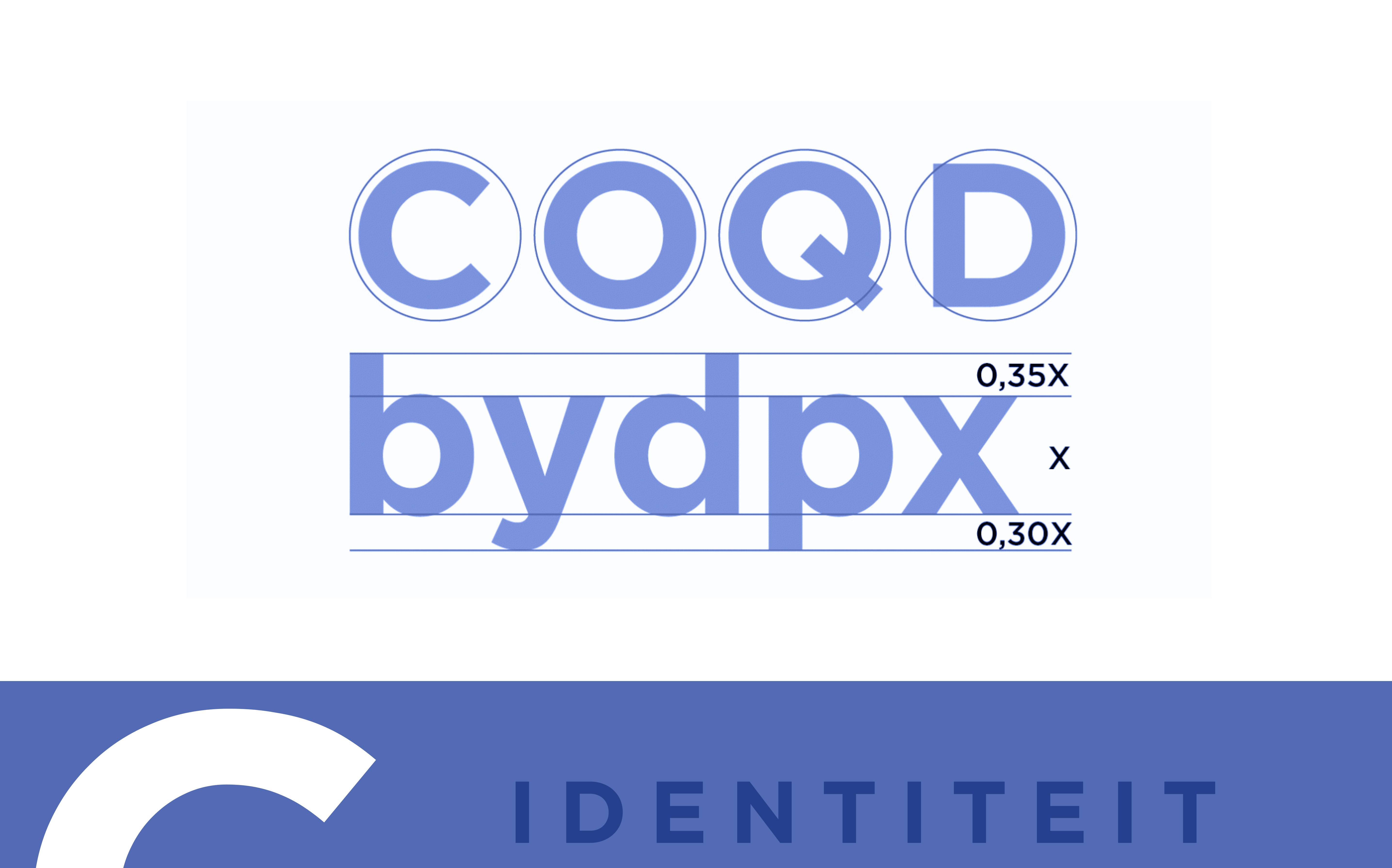
I went for a minimal, clean style — plenty of white space, simple layouts, and subtle accents in blue, white, and red to quietly reference Gotham’s American origins. Every page was designed with balance and clarity in mind, using grid-based compositions and consistent typography so that the focus stayed on the letterforms themselves.
HISTORICAL CONTEXT
The design moves through Gotham’s history and context, from its inspiration in New York’s mid-century architectural signage to its role in high-profile uses like the 2008 Obama campaign. This narrative is supported by a layout that mirrors Gotham’s qualities: geometric precision, openness, and a modern yet timeless feel.
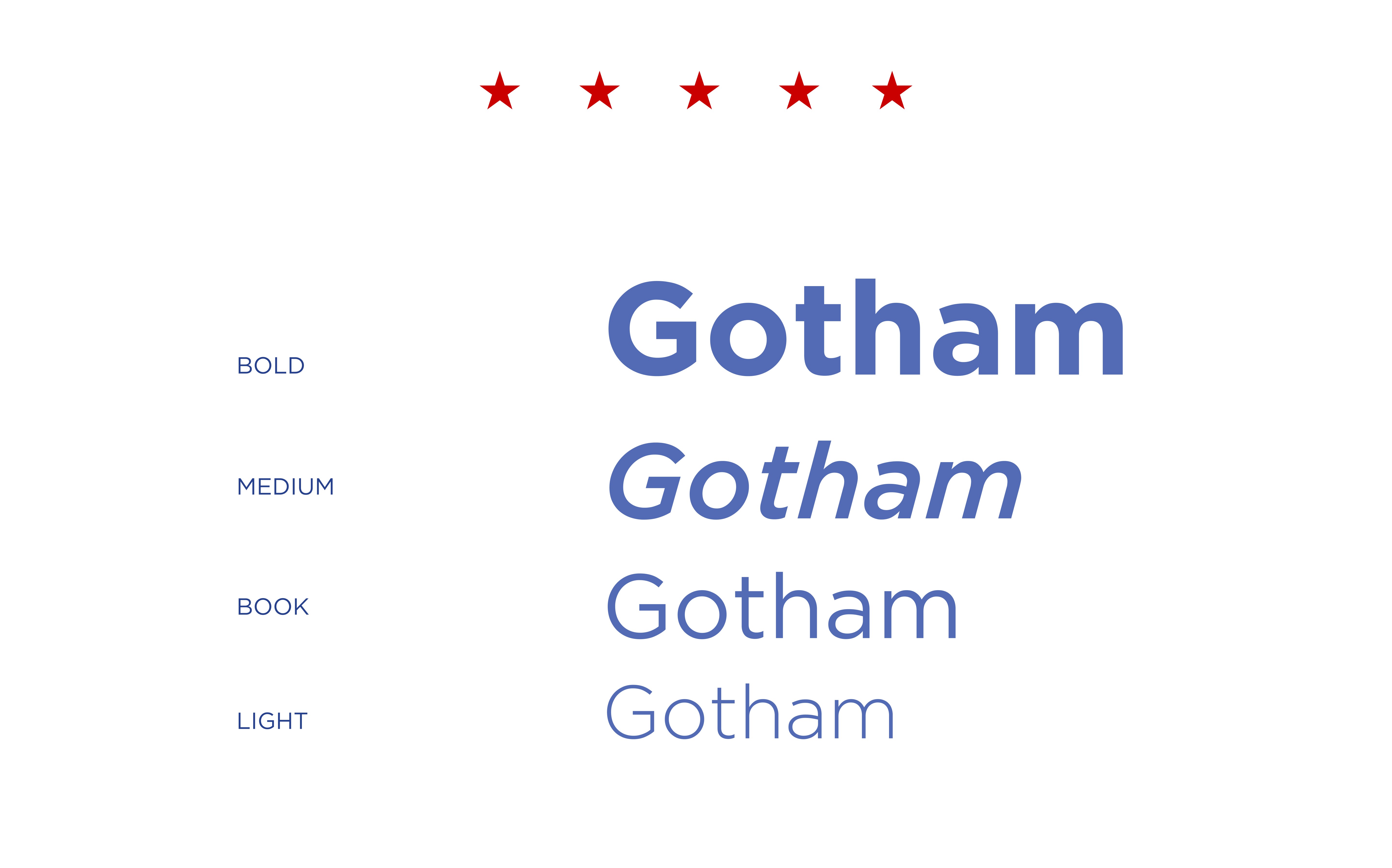
I also experimented with scale and placement, showing large, bold letterforms on some spreads, and smaller, more detailed text settings on others, to highlight how Gotham works in different contexts. Paired with subtle color accents and carefully considered spacing, the result is a specimen that feels direct, structured, and easy to navigate, while still telling a clear story about the typeface’s design and cultural influence.
Summary :
This project allowed me to combine research and design in a focused, minimal style that highlights the essence of the Gotham typeface. By balancing clean layouts with subtle color accents and thoughtful composition, I created a type specimen that not only presents the letterforms clearly but also tells the story behind the font’s unique character and cultural significance. The experience strengthened my ability to translate complex ideas into simple, effective visual communication.
More Projects


Graphic Design
Gotham Typespecimen Design
Gotham is a commissioned school project in which I designed a complete type specimen to showcase the context, history, and personality of the iconic Gotham typeface. Through a clean, structured layout, balanced compositions, and thoughtful visual accents, the design brings together research and storytelling to highlight the font’s origins, characteristics, and cultural impact.
Year :
2025
Commissioned by:
HOGESCHOOL VAN AMSTERDAM
Project Duration :
5 Weeks
GOTHAM: AN IN-DEPTH EXPLORATION OF FORM AND FUNCTION
For this commissioned school project at the Amsterdam University of Applied Sciences, I designed a type specimen that explores the story, character, and impact of the iconic Gotham typeface. The goal was not just to show its letterforms, but to create a design that reflects its personality and roots.
I went for a minimal, clean style — plenty of white space, simple layouts, and subtle accents in blue, white, and red to quietly reference Gotham’s American origins. Every page was designed with balance and clarity in mind, using grid-based compositions and consistent typography so that the focus stayed on the letterforms themselves.
HISTORICAL CONTEXT
The design moves through Gotham’s history and context, from its inspiration in New York’s mid-century architectural signage to its role in high-profile uses like the 2008 Obama campaign. This narrative is supported by a layout that mirrors Gotham’s qualities: geometric precision, openness, and a modern yet timeless feel.
I also experimented with scale and placement, showing large, bold letterforms on some spreads, and smaller, more detailed text settings on others, to highlight how Gotham works in different contexts. Paired with subtle color accents and carefully considered spacing, the result is a specimen that feels direct, structured, and easy to navigate, while still telling a clear story about the typeface’s design and cultural influence.
Summary :
This project allowed me to combine research and design in a focused, minimal style that highlights the essence of the Gotham typeface. By balancing clean layouts with subtle color accents and thoughtful composition, I created a type specimen that not only presents the letterforms clearly but also tells the story behind the font’s unique character and cultural significance. The experience strengthened my ability to translate complex ideas into simple, effective visual communication.
More Projects
Graphic Design
Gotham Typespecimen Design
Gotham is a commissioned school project in which I designed a complete type specimen to showcase the context, history, and personality of the iconic Gotham typeface. Through a clean, structured layout, balanced compositions, and thoughtful visual accents, the design brings together research and storytelling to highlight the font’s origins, characteristics, and cultural impact.
Year :
2025
Commissioned by:
HOGESCHOOL VAN AMSTERDAM
Project Duration :
5 Weeks
GOTHAM: AN IN-DEPTH EXPLORATION OF FORM AND FUNCTION
For this commissioned school project at the Amsterdam University of Applied Sciences, I designed a type specimen that explores the story, character, and impact of the iconic Gotham typeface. The goal was not just to show its letterforms, but to create a design that reflects its personality and roots.
I went for a minimal, clean style — plenty of white space, simple layouts, and subtle accents in blue, white, and red to quietly reference Gotham’s American origins. Every page was designed with balance and clarity in mind, using grid-based compositions and consistent typography so that the focus stayed on the letterforms themselves.
HISTORICAL CONTEXT
The design moves through Gotham’s history and context, from its inspiration in New York’s mid-century architectural signage to its role in high-profile uses like the 2008 Obama campaign. This narrative is supported by a layout that mirrors Gotham’s qualities: geometric precision, openness, and a modern yet timeless feel.
I also experimented with scale and placement, showing large, bold letterforms on some spreads, and smaller, more detailed text settings on others, to highlight how Gotham works in different contexts. Paired with subtle color accents and carefully considered spacing, the result is a specimen that feels direct, structured, and easy to navigate, while still telling a clear story about the typeface’s design and cultural influence.
Summary :
This project allowed me to combine research and design in a focused, minimal style that highlights the essence of the Gotham typeface. By balancing clean layouts with subtle color accents and thoughtful composition, I created a type specimen that not only presents the letterforms clearly but also tells the story behind the font’s unique character and cultural significance. The experience strengthened my ability to translate complex ideas into simple, effective visual communication.